Building Intripid Design System - a Case Study

⏰ Project Duration — 2 Weeks
👨💻 Role — Lead Product Designer
🏢 Organization — Intripid
🛠️ Service — Research, Strategy, Documentation, Resources, Governance, Maintenance
Introduction to Intripid and My Role
I joined Intripid as the sole Product Designer at a pivotal moment, tasked with designing a comprehensive and cohesive experience for a growing platform. The company was gearing up to offer personalized AI-driven travel itineraries, and with that came the need for a unified design language across the product. However, there was no design team to back me, no existing files, and no clear roadmap for building a design system.
It was a challenge that I knew would be a major opportunity to shape the company’s design foundations. The stakes were high — not just for me but for the success of the product.
Starting with Nothing
As the only designer, I had to wear multiple hats. There were no design assets, no style guides, not even a proper job description to lean on. I realized quickly that without a robust design system in place, we’d never scale efficiently. I had a vision of building a cohesive UI kit, but I knew that just having a vision wasn’t enough — I had to communicate the value of this system to the business.

Research and the First Steps
Creating a design system for a complex, AI-driven platform was no small feat. I started with deep research, scouring through resources from industry giants like Airbnb, Google, and Atlassian to understand how they approached their systems. I knew I needed to get the fundamentals right, so I dedicated time to learning from others who had tackled similar challenges.
Inventory: Mapping Every Element
My next move was to do an inventory of every single UI element in our product. I took a detailed audit, screenshotting and documenting every button, modal, dropdown, and icon across the platform. It was painstaking work, but essential. The inconsistencies were clear — buttons in all shapes and colors, font weights scattered across the board. This was my wake-up call that a unified system was more than just an improvement, it was a necessity.
The Audit and Rebuilding Process
After gathering everything, I meticulously categorized and grouped every UI element, identifying patterns (and more often, inconsistencies). It was time to make sense of the chaos. Naming conventions were decided, categorization was streamlined, and everything was rebuilt from scratch in Figma.
This was the most detailed part of the process — organizing layers, renaming symbols, and making sure everything fit into a consistent structure that others could easily follow. It wasn’t just about cleaning up, it was about future-proofing the design.
Building for the Future
Design systems are living documents — they evolve as the product and the company grow. I made it a priority to ensure the design system wasn’t static. Weekly updates, audits, and feedback sessions became a regular part of the routine. My goal was to create a system that could grow with Intripid, providing a solid foundation for future designers if or when they joined, and ensuring consistency as the product expanded.
BUT WHAT IS A DESIGN SYSTEM?
A design system is like a cookbook. A cookbook is a collection of recipes and each recipe requires certain ingredients. A design system, therefore, is a collection of instructions on how software at company X should be built. There are recipes for modals, menus, forms, and any other interface elements a designer or developer may need. Instead of a cookbook designers create pattern libraries and style guides and accompany them with instructions for their use.
Resources
Throughout this journey, resources like Atomic Design by Brad Frost and Pattern Lab were invaluable. They provided frameworks and insights that served as a blueprint for developing a sustainable design system.


Examples
Companies like IBM, Airbnb, Google, Apple, and Atlassian have complex and well-documented design systems that served me as both inspiration and guide.


Benefits of having Design System
- Saving a lot of time.
- Ensuring UI consistency (often associated with increasing brand trust).
- Reducing complexity and ambiguity.
- Enabling and facilitating collaboration and consensus.
- Creating a foundation for further improvement.
For an extensive list of benefits, read InVision’s free Design Systems Handbook.
FOUNDATION
🎨 Color
Colors are the mood-makers of your design. Our palette is like a box of perfectly matched crayons, with primary, secondary, and neutral shades that bring harmony and balance to each page.
The brand color itself is one of the most intuitive visual elements that is used to embody product characteristics and communicate its ideas.
The primary color of Intripid’s brand color is the Purple (HEX#AE6EFF) & Orange (HEX#FE9549), the color application of these color is mainly for primary button or key action point, graphics, imporant messages, and many other scenes.
💡In this design, the color system is used more based on information delivery, operational guidance, and interactive feedback purposes. And the most important thing when you try to apply these colors to the design is don’t forget the main goal: to have clear communication of our information.

🖋 Typography
What is it for?: Typography is used for basic text writing; including headings, body text, lists, and more.
When to use?: When there is a need to display a title, label, paragraph contents in the dashboard (table, form, card, etc.) It also can be used when you need a copyable/editable/ellipsis texts.
Font: The font system is one of the most foundational parts of any interface design. And the font family that was chosen for this design is Familjen Grotesk (for HEADING) & Urbanist (for BODY, BUTTON & LINK, and FIELDS)

Font Size & Weights

📏 Border and Spacing
Border Radius
What is it for?: The border radius is used to make rounded corners for the outer border edge of an element. This property is almost used in every component in the design, like button, card, table row, etc.
When to use?: When there is a need to make a more standout component than the other components.

Spacing
What is it for?: The spacing is used to avoid components clinging together. A content with a good amount of white space will help to balance the design elements and better organize content, it helps to improve the visual communication experience.
When to use?: When there is a need to avoid components clinging together, the spacing is the space between components within a component, it can be used both vertically or horizontally. The spacer & padding components will really benefit if there is a need to have customize the spacing between components.

📏 Layout and Grid
Layout
What is it for?: The layout is used for establish the starting point of systematic visual design, it also can helps the content to highlight the information by its priority; which one is more important and which one is less. Perhaps, layout is invisible for the user, but it’s relevant to navigation.
Grid
What is it for?: Grid is used to create a proportional distribution and to give a high consistency to the interface. Grid will provide stability, consistency, and familiarity for the design.

✨ Effects Syles
What is it for?: Effects styles are used to create visual cues for UI components. Applying effects styles like shadows could create a visual hierarchy and impression of depth, which help users on how to use the interface component.
When to use?: When there is a component that requires more attention from the user, or just wants to “separate” the component from others. For instance, cards, modals, and many more.
Shadow: The shadows effects is used frequently in the design.

👾 Icon
What is it for?: Icon is a graphical representation of meaning. An icon is used to express actions or states. It can contribute greatly to speeding comprehension and understanding, even more, when the icons have a recognizable form and bring familiarity to user.
When to use?: When there is a need to create a positive and intuitive action for user, most frequently used for navigation.

💡Always try to keep the consistency for the icons and avoid to use icons with conflicting meaning.
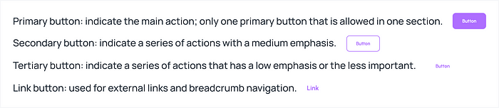
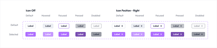
🕹 Button
What is it for?: The button is used to trigger an operation or action for the user.
When to use?: When there is a need for user to make a decision or an operation.
In Intripid we have 4 types of buttons:
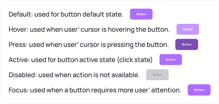
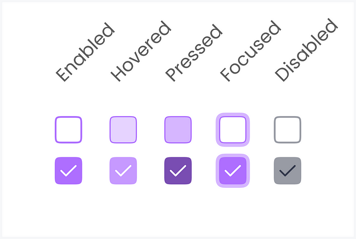
A button can have 6 states — at most and can have 2 states — at least.


NAVIGATION
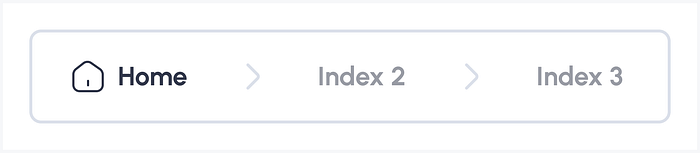
🍞 Breadcrumb
What is it for?: The breadcrumb is used to displays the current location of the user journey, it allows the user to keep on their track.
When to use?: When the system have multiple layers in their hierarchy, or when the design give the user ability to navigate back to the higher hierarchy. Frequently displayed below the header section.
🤔 How to use?: In a breadcrumb, the user will see their current location in a bolder text style, meanwhile the higher hierarchy will be displayed in a lighter text style. Below is the example of how it looks like, and how it looks when applied in an actual design:
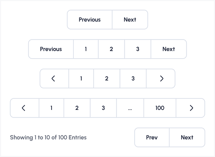
📑 Pagination
What is it for?: It’s an alternative way to look at the extended list information, pagination will divide the information into several pages, which makes the information will be displayed only one page at a time.
When to use?: It can be used when the user need to browse the information by navigating through pages. The pagination usually placed below the infomation content.
🗂 Tabs
What is it for?: Tabs is used to give the ability for user to switch the view of content when there are multiple views or options of it.
When to use?: When there are multiple views or options of content in one section.

DATA ENTRY
✅ Checkbox
What is it for?: To select multiple values from a list of options, it can be used in forms, tables, lists, and more. Even if its purpose is to select multiple values, it also can be used just to select one value.
When to use?: When there is a possibility from the user to select multiple values.
🔘 Radio
What is it for?: To select a single value from a list of options, it frequently used in forms and lists.
When to use?: When there is a need from the user to only select single value in list of options.

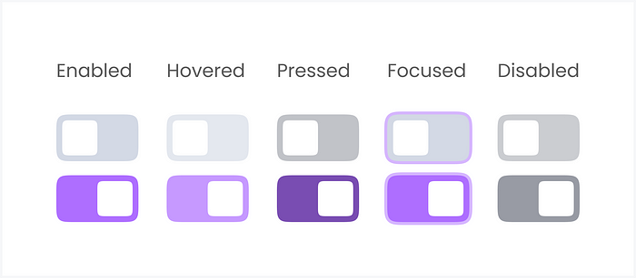
🎚️ Toggle
What is it for?: It’s commonly used for binary settings or features that can be enabled/disabled.
When to use?: Choose toggles for binary settings with immediate effects, system-level changes, or mobile interfaces where the switch metaphor feels natural.
⌨️ Text Input
What is it for?: Text Input component is a basic type of data entry in any website or application. This component frequently used in forms, modals, or any content that has data entry or information related.
When to use?: Every time user need to input their data or information, it can be add new or even edit.

DATA DISPLAY
🎭 Avatar
What is it for?: Avatar is usually used to display user’ representation in the form of image or object.
When to use?: When there is a need to display user’ representation in the form of image or object, i.e., Profile.
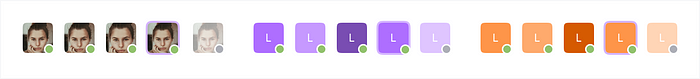
🏷 Badge
What is it for?: Badge is used to display information in the form of small numerical values or text — status. It is frequently used on notification and status tags.
When to use?: When there is a need to notify user about new information or to give an additional detail about the information displayed.
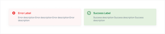
💬️ Feedback
What is it for?: To display the feedback in response to the user’ action or operation. It can be a message banner feedback or alert.
When to use?: There is a need to give user feedback on their actions.
How to use?:
💡 The Banner components are used to provide a success or happy warning, and error message.
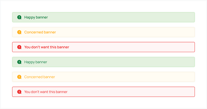
💡 Meanwhile, the Alert feedback components are usd to show alert to user, it frequently used for an alert related to the system, i.e., database error.
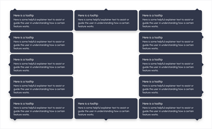
💡Tooltip
What is it for?: Tooltip component is a simple tip text that popup.
When to use?: There is a need to display a tip when user hover their cursor on a subject.
Conclusion: Building for the Future
In my perspective, building and scaling a design system is an ongoing process. It requires careful planning, collaboration, and continuous iteration. The benefits, however, are well worth the effort. Not only does a design system ensure consistency and efficiency, but it also enables teams to work faster and more effectively.
As I continue to refine and expand the design systems I’ve built, I’ve learned to embrace flexibility while maintaining structure. This balance allows for innovation while keeping the user experience at the forefront.
I hope these insights help you on your journey to building a scalable and efficient design system. If you have any questions or would like to share your own experiences, feel free to reach out!
Thanks for reading. If you are creating your own design system, or just want to learn more, check out the resources below:
- The UI Prep Syllabus on Design Systems
- Pattern Lab
- Material.io
- Free UI kits from sketchappresources
- This series of posts on how the team at Customer.io did it
- Atomic Design Book, by Brad Frost
Did you know? You can hold that clap button for a few seconds to give a maximum of 50 Claps 👏. I would really appreciate it

